
A Tailwind CSS component library that brings the shadcn/ui design system to any web stack, no React required. You get beautiful, accessible components as simple semantic classes, with a small vanilla JavaScript module driving the interactive ones. React, Vue, Angular, Laravel, Rails, Django, or plain HTML - if it runs Tailwind, it works.
Visit startingpointui.com for full documentation and live examples.
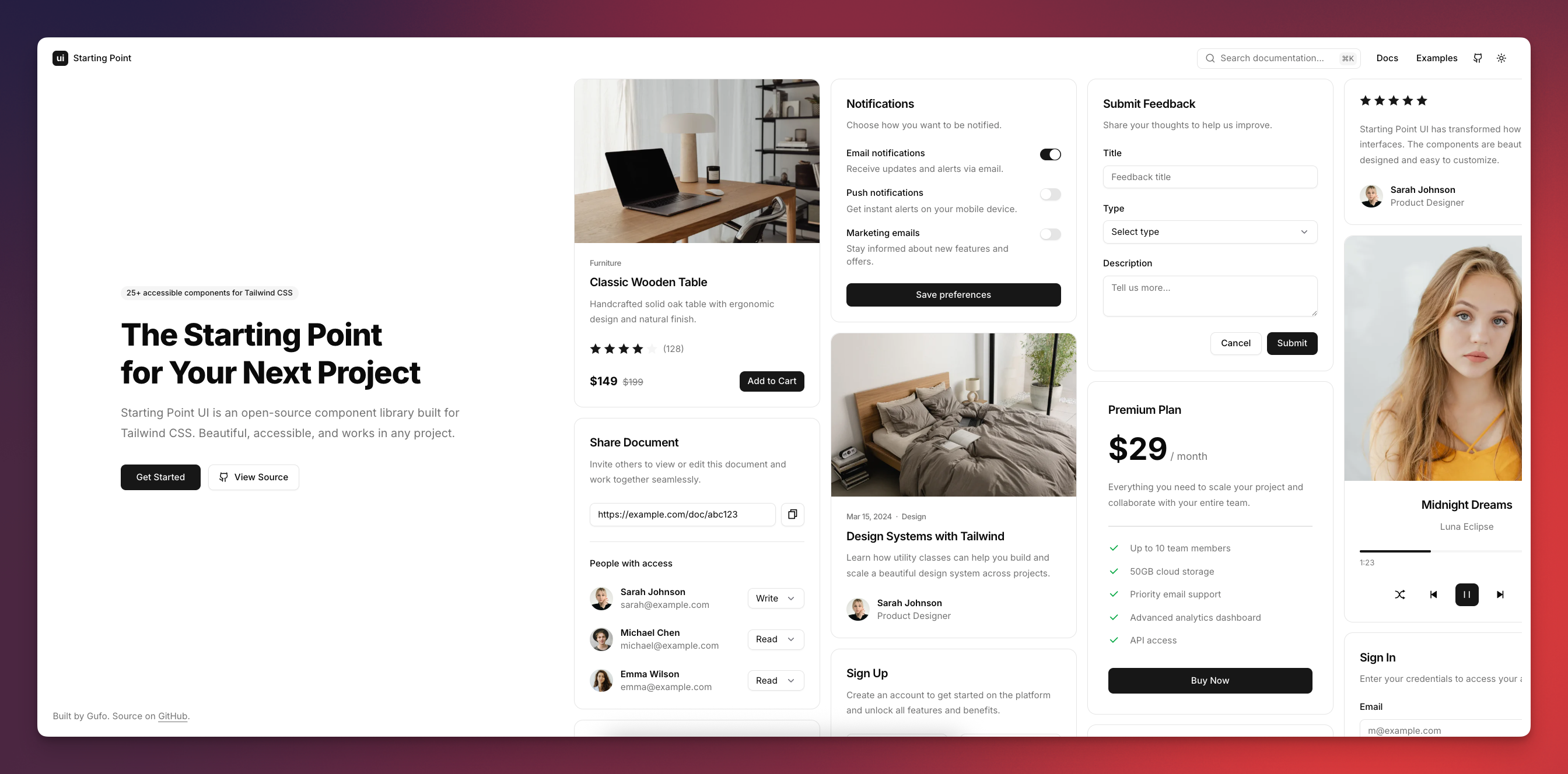
- CSS components - semantic classes like
btn,card, anddialogthat style your markup. - No framework required - built with Tailwind CSS and vanilla JavaScript, works in any web stack.
- Accessible - aria attributes, keyboard navigation, and focus management are wired up for you.
- RTL support - layouts and interactions mirror when
dir="rtl"is set. - Dark mode - light and dark color schemes out of the box.
- Customizable - theme with shadcn/ui-compatible CSS variables or adjust with Tailwind utilities.
- Lightweight - only the classes you use are compiled, and the JavaScript module is optional.
Beautiful components for building complete interfaces:
Accordion, Avatar, Badge, Brand, Breadcrumb, Button, Button Group, Card, Checkbox, Collapsible, Combobox, Dialog, Dropdown, Field, Input, Input Group, Kbd, Label, Navbar, Pagination, Popover, Progress, Radio Group, Scrollbar, Select, Separator, Sheet, Sidebar, Slider, Switch, Table, Tabs, Textarea, Toast, Tooltip
Install the package:
npm install starting-point-uiAdd the import to your CSS file:
@import "tailwindcss";
@import "starting-point-ui";
Use components in your markup:
<button class="btn btn-primary">Get Started</button>For interactive components (dialogs, dropdowns, tabs, etc.), add the JavaScript:
<script
  src="https://cdn.jsdelivr.net/npm/starting-point-ui@0.39.0"
  type="module"
></script>
Or import it in your bundler:
import "starting-point-ui";Starting Point UI is designed to be the first thing you install in any new project. Regardless of what you're building or what framework you choose, the components are always the same - so you can start every project from the same familiar foundation.
- Discord - Hang out, get help, and share what you've built
- GitHub Discussions - Ask questions or suggest features
- GitHub Issues - Report bugs
MIT